CURRENTLY: DESIGNSTUDIO NYC ︎
EMAIL: HEY@WINNLUKE.COM
INSTAGRAM: WINN_LUKE ︎︎︎
RESUME ︎︎︎
PROJECT //
DESIGNSTUDIO NYC
 unselectable="on">
 BRAND IDENTITY / BRAND LOCALIZATION / BROADCAST TOOLKIT / LOGO DESIGN
PROJECT //
Underground
unselectable="on">
BRAND IDENTITY
PROJECT //
PREMIER LEAGUE

IN-HOUSE DESIGNER / EDITORIAL / CAMPAIGNS / PARTNERSHIPS / SOCIAL / BRAND DESIGN
PROJECT //
DESIGNSTUDIO NYC

BRAND IDENTITY / BRAND ARCHITECTURE / NAMING
PROJECT //
DESIGNSTUDIO NYC
L / C / S
BRAND IDENTITY / BROADCAST
PROJECT //
PERSONAL

GRAPHIC DESIGN / ILLUSTRATION / MOTION / PERSONAL
PROJECT //
PERSONAL

GRAPHIC DESIGN / ILLUSTRATION
PROJECT //
FREELANCE
 unselectable="on">
 BRAND LOGO
Clients include:
Premier League
Riot Games WILD RIFT
Riot Games LCS
Alludo (FKA Corel)
England Football Association (FA)
World Rugby
Wundr
RHO Banking
Ab InBev (Budweiser)
Amazon
Brighton & Hove Albion FC
Barçelona FC
Fake Turins Band
Mentoring includes:
Mindot Mentoring @ DesignStudio
Arena Mentoring Scheme
Premier League
Riot Games WILD RIFT
Riot Games LCS
Alludo (FKA Corel)
England Football Association (FA)
World Rugby
Wundr
RHO Banking
Ab InBev (Budweiser)
Amazon
Brighton & Hove Albion FC
Barçelona FC
Fake Turins Band
Mentoring includes:
Mindot Mentoring @ DesignStudio
Arena Mentoring Scheme
League of Legends:
Wild Rift Esports
DESIGNSTUDIO NYC
RIOT GAMES ︎
BRAND IDENTITY / BRAND LOCALIZATION / BROADCAST TOOLKIT / MOTION DESIGN
DSNY CASE STUDY ︎︎︎
BRAND NEW ︎︎︎
GRILLI TYPE ︎︎︎
RIOT GAMES ︎
BRAND IDENTITY / BRAND LOCALIZATION / BROADCAST TOOLKIT / MOTION DESIGN
DSNY CASE STUDY ︎︎︎
BRAND NEW ︎︎︎
GRILLI TYPE ︎︎︎
Riot Games launched WildRift: a mobile version of League of Legends with the ambition to become the world’s premier mobile-first esport franchise. They needed an esport ecosystem that would speak to fans and players worldwide; a multifunctional brand that can act as a governing body, broadcaster, content publisher and global events organiser.
Our global focus groups revealed that fans wanted something different: a sport where pro-players were relatable and competitive play felt within reach; a sport that celebrates those who ‘win differently’ instead of simply being ‘the best’; and a sport that pushes the industry to be more diverse, dynamic and inclusive than ever before.
We developed a visual language inspired by the games’ mobile format. Gestures and swipes express the flair and style of each player within this high pace sport, while dramatic perspectives of the selfie camera guided our layouts and art direction.


We introduced a type system that could easily roll out across the world. A variable family that created global consistency but allowed tonal variations throughout regions and communications.
Collaborating with Grilli Type we created typeface inspired by our gestures, designed to be stretched and distorted, giving the brand its distinctive look whilst requiring a minimal effort to use and adapt.
Collaborating with Grilli Type we created typeface inspired by our gestures, designed to be stretched and distorted, giving the brand its distinctive look whilst requiring a minimal effort to use and adapt.

GT Flexa WR Folded combines both the Up and Down approach and pushes the type to a 3-dimensional space, intended for use on single word applications.
This unique version of GT Flexa combines Grilli Type’s style with Esports action for the perfect Wild Rift type.


Once we created the masterbrand, we embarked on sprints to localise the brand for eight regions across the world. We ran gamified strategic workshops and focus groups to engage the fans, getting under the skin of what makes each region unique.
These sessions gave us valuable insight into the differing perspectives on mobile gaming and provided common ground to rally the community.
These sessions gave us valuable insight into the differing perspectives on mobile gaming and provided common ground to rally the community.


Wild Rift Esports: LATAM

Wild Rift Esports: Japan

Wild Rift Esports: NA
The brand architecture creates a clear framework and central narrative for future events, it allows Riot to benefit from the efficiency of consistent assets for a global organisation of its scale and introduces flexibility to constantly excite fans and challenge the status quo of sports branding.


Premier League / In-house
PREMIER LEAGUE
IN-HOUSE DESIGNER ︎
GRAPHIC DESIGN/ EDITORIAL / PARTNERSHIPS / BRAND DESIGN /
IN-HOUSE DESIGNER ︎
GRAPHIC DESIGN/ EDITORIAL / PARTNERSHIPS / BRAND DESIGN /
After the Premier League underwent their first major rebrand, I was hired as the core-inhouse designer to oversee and work on all design output.
This involved the initial implementation of the new brand throughout all platforms, to evenutally evolving the ouput of the brand in the years to come in both the UK and the PLinUSA expansion.
This involved the initial implementation of the new brand throughout all platforms, to evenutally evolving the ouput of the brand in the years to come in both the UK and the PLinUSA expansion.
During my time I created digital and print campaigns the Premier League core brand and sub-brands, worked within the editorial and digital team on any design requirements.
Each season, a task was to illustrate the 80+ Premier League Home, Away and Third jerseys and any additional clothing assets for Live Broadcast use, the Premier Leauge Match Manager applicaton, Premier League Fantasy and Social.
Each season, a task was to illustrate the 80+ Premier League Home, Away and Third jerseys and any additional clothing assets for Live Broadcast use, the Premier Leauge Match Manager applicaton, Premier League Fantasy and Social.


Alludo Rebrand — (FKA Corel)
DESIGNSTUDIO NYC
COREL / ALLUDO ︎
BRAND IDENTITY / BRAND ARCHITECTURE
BRAND NEW ︎︎︎
MUSE AWARDS GOLD ︎︎︎
COREL / ALLUDO ︎
BRAND IDENTITY / BRAND ARCHITECTURE
BRAND NEW ︎︎︎
MUSE AWARDS GOLD ︎︎︎
For decades, Corel and its offering have been centered around the technicality and performance of its products.
It was clear to us at DesignStudio that it was time for Corel to change perspective and focus on people and new ways of working.
It was clear to us at DesignStudio that it was time for Corel to change perspective and focus on people and new ways of working.
This is how Corel would continue to thrive as a business and company, empowering people to work wherever and whenever they want. The new brand is built around the idea that Alludo’s software liberates companies from everyday constraints to reimagine where, when, and how we work, giving people the space to work and time for ideas.

We created a boundless visual world, where we break down convention and turn boundaries into boundlessness. Blurring the constraints of the working world, removing the heaviness of old structures. We use white space to give a sense of lightness in contrast to rich and surreal collages where people are at the center of the brand.
We’ve developed a suite of dynamic graphics that represent different working modes – focus vs collaboration and graphic containers inspired by their core products. The color approach is based on the time of the day, mirroring working patterns: Morning person, day getter, night owl.
We blend the grounded with the aspirational while blurring the boundaries between. Where every day people can be enabled to work without bounds, any time anywhere. As such, people appear front and center in our collateral, against the backdrop of surreal landscapes, illuminated by the hues of different times of day.


The Alludo symbol’s unique silhouette curves forward, off the beaten path, towards a boundless reality. The wordmark is tailored to match, with curving inktraps that echo the symbol.
There are times when we like to work alone and times when we work with others. To depict this, we have two different types of work mode shape: focus and collaborate.
They start at a base level, where a single focus mode shape represents any individual working by themselves. They duplicate and form evolved silhouettes as more people are pictured collaborating.


HOME︎
The Prince
Charles Cinema
PERSONAL
PRINCE CHARLES CINEMA ︎
GRAPHIC DESIGN / ILLUSTRATION / POSTER SERIES
PRINCE CHARLES CINEMA ︎
GRAPHIC DESIGN / ILLUSTRATION / POSTER SERIES
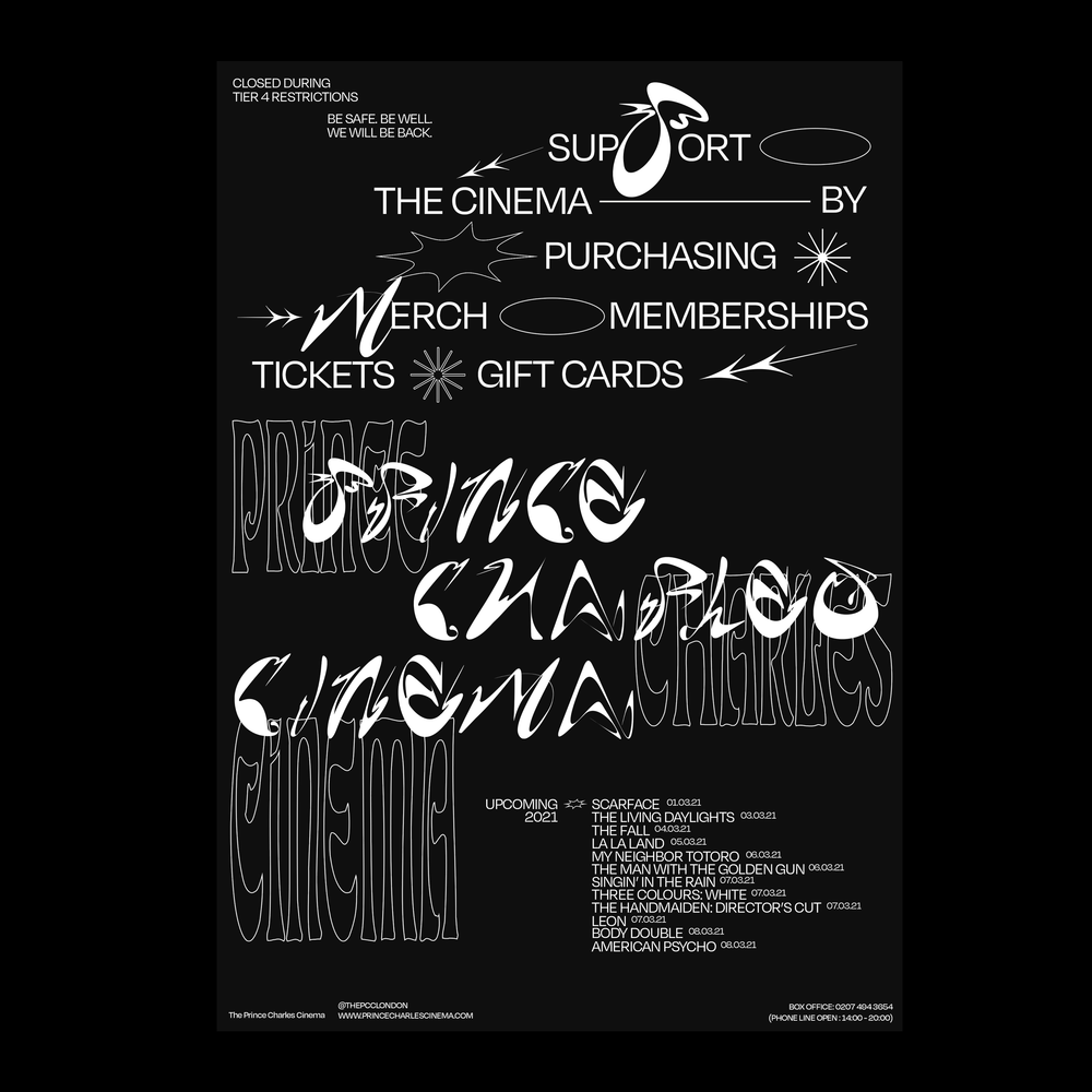
The Prince Charles Cinema was my favourite cinema and has been since I moved to London. It was one of the many cinemas hurt by the COVID pandemic and closed for several months. Created custom typeface and graphics inspired by ink from ticket-stubs.
With this, created a series of posters and type that could be used (only if they wanted to of course as they have an incredible team already) and providing the files as an option if they wished.


HOME︎
The Simpsons
Collective
PERSONAL
SIMPSONS COLLECTIVE ︎
GRAPHIC DESIGN / ILLUSTRATION / COPYWRITING
SIMPSONS COLLECTIVE ︎
GRAPHIC DESIGN / ILLUSTRATION / COPYWRITING
NOTABLE INSPO
︎ @scenic_simpsons
︎ @lynchiansimpsons
︎ @secondbestpetshop
︎ Simpsons Archive
︎ SimpsonsWiki
︎ SimpsonsArchive
︎ @lynchiansimpsons
︎ @secondbestpetshop
︎ Simpsons Archive
︎ SimpsonsWiki
︎ SimpsonsArchive
A dedication to the brands of the show the simpsons and their real life inspiration.
A cartoon that can seamlessly weave in multi-layered satirical comedy whilst slipping in crushing realizations about modern day family life.
A cartoon that can seamlessly weave in multi-layered satirical comedy whilst slipping in crushing realizations about modern day family life.
Characters that are over-exaggerated versions of day-to-day personalities you may encounter on the street that appear for swift one-liners or episode length back-story constructing stories.


Krusty Burger.
“All proceeds to go to Krusty Burglar’s family”*
(RIP 1920-1995).
“Clown Run Burger Joint”
The idea for the redesign posed the question — What would the “Krusty Burger” brand look like if “Krusty The Clown” was faced with crippling—debt through torrid relationships with illegitimate businessmen, the bankruptcy from paying a lawsuit after his company mascot “The Hamburglar” was beaten in the parking lot then forced to quote - “sell out” - his infamous burger joint? What would happen if he was still on the board of directors, trying his hardest to keep his signature “tainted”, "crooked" and “unprofessional” touch on the product but with a corporate overtone?
The idea for the redesign posed the question — What would the “Krusty Burger” brand look like if “Krusty The Clown” was faced with crippling—debt through torrid relationships with illegitimate businessmen, the bankruptcy from paying a lawsuit after his company mascot “The Hamburglar” was beaten in the parking lot then forced to quote - “sell out” - his infamous burger joint? What would happen if he was still on the board of directors, trying his hardest to keep his signature “tainted”, "crooked" and “unprofessional” touch on the product but with a corporate overtone?
Design wise playing on a mix of a harsh, viscous, digital vibe as if it was a real corporation in charge with some slight hints to 60's burger joints where the rough and friendly type mixes subtly but ultimately it's weighed out by the awful, counterproductive messaging. Citing moments from the show, as Krusty Burger failed to properly sponsor the 1984 Soviet Olympics and playing on the obnoxious characters involved allowed me to create a whole idea from this.


*The Family of Krusty Burglar Co.


Lionel Hutz Law Firm,
AKA Miguel Sanchez, AKA DR. Nguyen VAN Phuoc
“Crooked Law Firm / Shoe Repair”
I Can't Believe It's A Law Firm or Lionel Hutz Attorney Also Expert Shoe Repair is a shop space at Springfield Mall owned by Lionel Hutz and is the HQ for his practice of law.
Lionel Hutz: Well, he's had it in for me ever since I kinda ran over his dog. Marge: You did? Lionel Hutz: Well, replace the word "kinda" with the word "repeatedly," and the word "dog" with "son."
︎︎︎ Smoking Monkeys Handed Out Upon Arrival
︎︎︎ Watches Matlock every Evening (Sound not on)
︎︎︎ Sells Birdcages.
︎︎︎ This isn’t the YMCA?
︎︎︎ RIP Phil Hartman.
︎︎︎ No, money down!


BUZZ COLA
*Contains 2x SUGAR & — 2x CAFFEINE°
1-888-555-0109*
Buzz Cola is a brand of cola, and an officially licensed product of Twentieth Century Fox. Its slogan is "twice the sugar, twice the caffeine". There are several different varieties available around Springfield, including Crystal Buzz Cola, Diet Buzz Cola, Cherry Buzz Cola, Buzz Cola Vanilla, Caffeine-Free Buzz Cola, Buzz Cola with Lemon and Buzz 2XUB.
The slogan is a parody of the former Jolt Cola slogan "all the sugar and twice the caffeine". A prior slogan used was "There's a little boogie in every bottle (can)".
The slogan is a parody of the former Jolt Cola slogan "all the sugar and twice the caffeine". A prior slogan used was "There's a little boogie in every bottle (can)".
︎︎︎ Carbonated Drink
︎︎︎ Not Poisonous
︎︎︎ Get Energized without the cramps.
︎︎︎ Soft(?) Drink
︎︎︎ 24 pack costs $12.99.

HOME ︎